By SciELO Accessibility1
Accessibility improvements to the SciELO Brazil Collection website
Image: Hal Gatewood.
Throughout its 26 years of existence, the recurring maintenance of the interface of all SciELO sites (SciELO Network portal, national collections, search engine etc.) was not executed in a joint and standardized manner. Carried out in a fragmented fashion, the results tended not to satisfactorily address the consistent nature of the interfaces. Consequently, usability and navigability behaviors remained different when distinct devices and operating systems were considered (desktop, tablet, Android, iOS).
In view of this, SciELO Accessibility carried out a pilot study to identify and classify barriers to accessibility on the SciELO Brazil Collection website. The initiative consisted of subjecting the SciELO methodology website to a heuristic evaluation, the method of which involves inspecting and testing the usability and navigability of the interface in order to identify any accessibility issues.
These procedures were carried out by four Special Education professionals, two visually impaired professionals who use screen reader software, and a Human Computer Interaction (HCI) PhD in Computer Science. Using manual (with and without using screen readers) and electronic WAVE Web Accessibility Evaluation Tool2 verification procedures.
The results of the evaluation made it possible to identify and correct elements that had a critical impact on the website accessibility, among which the following stand out: interface not suitable for mobile devices, lack of contrasts and colors perceptible to people with color blindness, inadequate font size and buttons, and reading by screen readers hindered by the lack of information hierarchy.
The improvements made to the platform are presented in this second part of the post Accessibility in the SciELO Program: current status and future prospects – Part 1.3
The article page was made responsive, ensuring good navigation on a variety of screen sizes. In this process, each of the interface components is developed individually and the changes are made globally. This methodology is known as a design system. The adaptation of the interface components was supported by the visual prototyping tool Figma.
Besides responsiveness, the new interface of the SciELO methodology websites will offer two versions: light mode, with a white background, and night mode, which uses a dark background.
The websites of the national SciELO collections are essentially made up of text, hence the special attention paid to font size, considering the hierarchy of the information. It was decided to maintain a standard of 16px for interface elements and 18px for the body text of articles, as well as considering sans-serif fonts to ensure fluidity when reading on screen. Although these are the standard values, the reader can increase or decrease the font size of the texts for more comfortable reading and a more personalized experience.
Usability X Accessibility
Considering the table below, based on The Importance of Usability and Accessibility in Design,4 which highlights the differences between accessibility and usability, we understand that the application of design system concepts so far has had usability as its main objective, aiming to standardize components and improve learning time and task performance.
| Main aspects of usability | Main aspects of accessibility |
| Learnability: How quickly can users learn to use an interface. | Compatibility with screen readers for the visually impaired. |
| Efficiency: How quickly users can perform their tasks. | Keyboards and shortcut navigation for those who cannot use a mouse. |
| Memorability: How well users remember how to use the interface after a while of not using it. | Subtitles and transcripts for audio and video content, catering for people with hearing impairments. |
| Satisfaction: How pleasant the overall experience is. | Color contrasts suitable for people with color blindness or low vision. |
Among the main accessibility topics cited, the appropriate color contrast has been resolved by the design system, as far as navigation buttons, links and iconography are concerned. Items such as compatibility with screen readers, keyboards, shortcut navigation and the use of other assistive technologies still need to be improved as interface elements.
A strong point and one of the main focuses of the design system in relation to accessibility was responsiveness, which refers to adapting the interface to different screen sizes.
The new interface of the SciELO methodology websites has received satisfactory scores from the main accessibility validators, such as AccessMonitor,5 as well as following international recommendations, such as the European Accessibility Act.6 Some decisions were also made considering the other countries included in the SciELO Network and their legislation, as well as local internet connection infrastructure characteristics.
Improvements / comparison
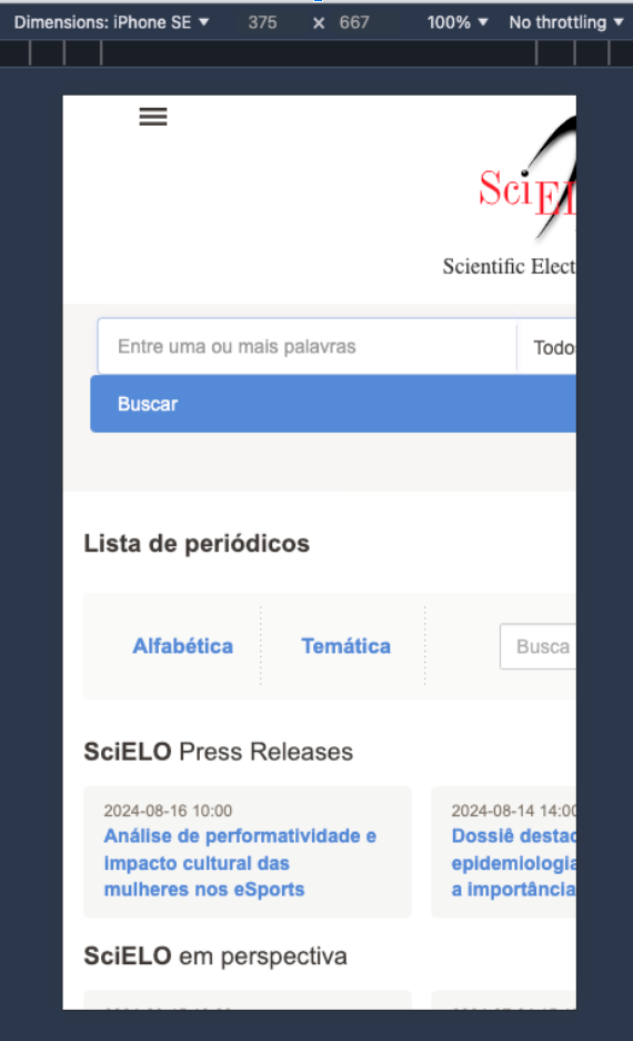
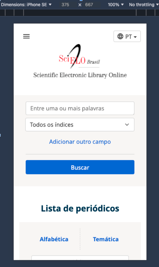
For the website improvement process, the Mobile-First Design Approach was used, in which suitability for mobile devices is prioritized. This assumes that if all the content and resources are accessible on small screens / mobile devices, they will also be accessible on larger screens.
The following are examples of buttons and fonts that are suitable for being clickable on smaller devices:
| Before | After |
|
Image description: Screenshot of a smartphone browser of the top left of the home page of the SciELO Brazil Collection website in the version before the adjustments. Only a portion of the content is visible, the portion on the left. When you get to the right end of the screen, the display of content is interrupted, including the SciELO logo, the search box and button and the SciELO Press Releases feed, which appear cut in half. |
Image description: Screenshot of a smartphone browser of the top left of the home page of the SciELO Brazil Collection website in the version after the adjustments. The top part is fully visible and adjusted for the smartphone screen. The SciELO logo appears in full, centered, as do the search fields and button below. No content or element is hidden or halfway displayed. It is possible to view the interface’s language options in the top right-hand corner of the screen, which was not possible in the previous version. |
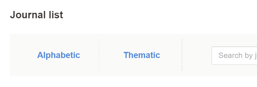
Action color contrast – Links and buttons (blue):
| Before | After |
|
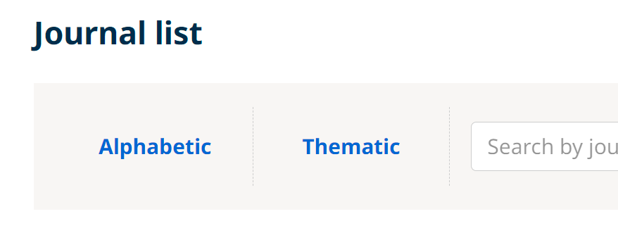
Image description: Screenshot of the “List of journals” section on the home page of the SciELO Brazil Collection website in the version before the adjustments. The “Alphabetical” and “Thematic” links are in a lighter shade of blue, with little contrast with the light gray background of the banner where the links are located. |
Image description: Screenshot of the “List of journals” section on the home page of the SciELO Brazil Collection website in the version after the adjustments. The “Alphabetical” and “Thematic” links are in a darker shade of blue, in greater contrast to the light gray background of the banner where the links are located. |

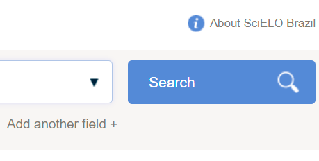
Image description: Screenshot of the “Search” button on the SciELO Brazil Collection website in the version before the adjustments. The button is in a lighter shade of blue, with little contrast with the light gray background of the strip where the button is located. The word “Search” is aligned to the left and there is a magnifying glass icon on the right-hand side of the button. |

Image description: Screenshot of the “Search” button on the SciELO Brazil Collection website in the version after the adjustments. The button is in a darker shade of blue, with greater contrast with the light gray background of the strip where the button is located. The word “Search” is aligned in the center and the magnifying glass icon has been removed. |
|
Image description: Screenshot of the floating navigation menu on the articles on the SciELO Brazil Collection website in the version before the adjustments. The buttons are in a lighter shade of blue, with little contrast with the background where the buttons are located. Half of the buttons are in front of a light gray background and the other half are in front of a white background. |
Image description: Screenshot of the floating navigation menu on the articles on the SciELO Brazil Collection website in the version after the adjustments. The buttons are in a darker shade of blue, in greater contrast to the background where the buttons are located. All the buttons are in front of a white background. The icons inside each button are more simplified compared to the icons in the previous version. |
All links have been formatted in the same color, ensuring standardization:
| Before | After |
|
Image description: Screenshot of the right part of the search field on the home page of the SciELO Brazil Collection website in the version before the adjustments. The links “About SciELO Brazil” and “Add another field +” are in dark gray. There is a blue “information” icon in image format on the left-hand side of the “About SciELO Brazil” link. |
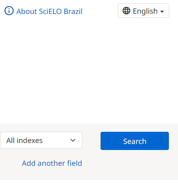
Image description: Screenshot of the right part of the search field on the home page of the SciELO Brazil Collection website in the version after the adjustments. The links “About SciELO Brazil” and “Add another field” are colored blue in the same tone as the buttons and other links on the site. The “information” icon to the left of the “About SciELO Brazil” link is also in the same shade of blue, but has been replaced by a standardized and accessible universal icon. |
|
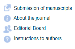
Image description: Screenshot of the top right of the home page of a journal on the SciELO Brazil Collection website in the version before the adjustments. The links and information icons are in different colors, with low contrast and little spacing between the lines, making selection difficult, especially on mobile screens and touchscreen use. The icons are in image format. |
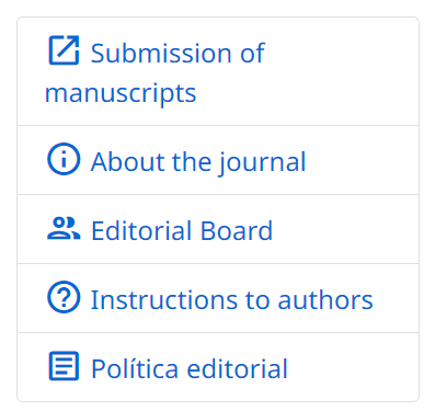
Image description: Screenshot of the top right of the home page of a journal on the SciELO Brazil Collection website in the version after the adjustments. The links and information icons are in the same color, with greater contrast and spacing between the lines and arranged in a table format with apparent borders, making selection easier, especially on mobile screens and touchscreen use. The image icons have been replaced by standardized and accessible universal icons. |
Standardized and accessible universal icons were used, with the minimum touch area suggested for mobile (google material icons):
| Before | After |
|
Image description: Screenshot of the part showing a sequence of icons used on the SciELO Brazil Collection website in the version before the adjustments. From left to right: a house, an arrow pointing northeast, two human figures one behind the other, a question mark icon, an information icon and an envelope. The icons are in image format, in a low-contrast color and with little spacing between them, making selection difficult, especially on mobile screens and touchscreen use. |
Image description: Screenshot of the part showing a sequence of icons used on the SciELO Brazil Collection website in the version after the adjustments. From left to right: a house, an arrow pointing northeast, two human figures one behind the other, a question mark icon, an information icon and an envelope. The icons are in a standardized and accessible universal format, in a color with greater contrast, with greater spacing between them and arranged in a table format with apparent borders, making selection easier, especially on mobile screens and touchscreen use. |
There has been an increase in font size and line spacing in the article’s body:
| Before | 
Image description: Screenshot of a paragraph from the “Introduction” section of an article on the SciELO Brazil Collection website in the version before the adjustments. The text size is small and the line spacing is short. |
|
After |

Image description: Screenshot of a paragraph from the “Introduction” section of an article on the SciELO Brazil Collection website in the version before the adjustments. The text size is small and the line spacing is short. |
There has also been an increase in the font size and line spacing of the navigation interface elements:
| Before | 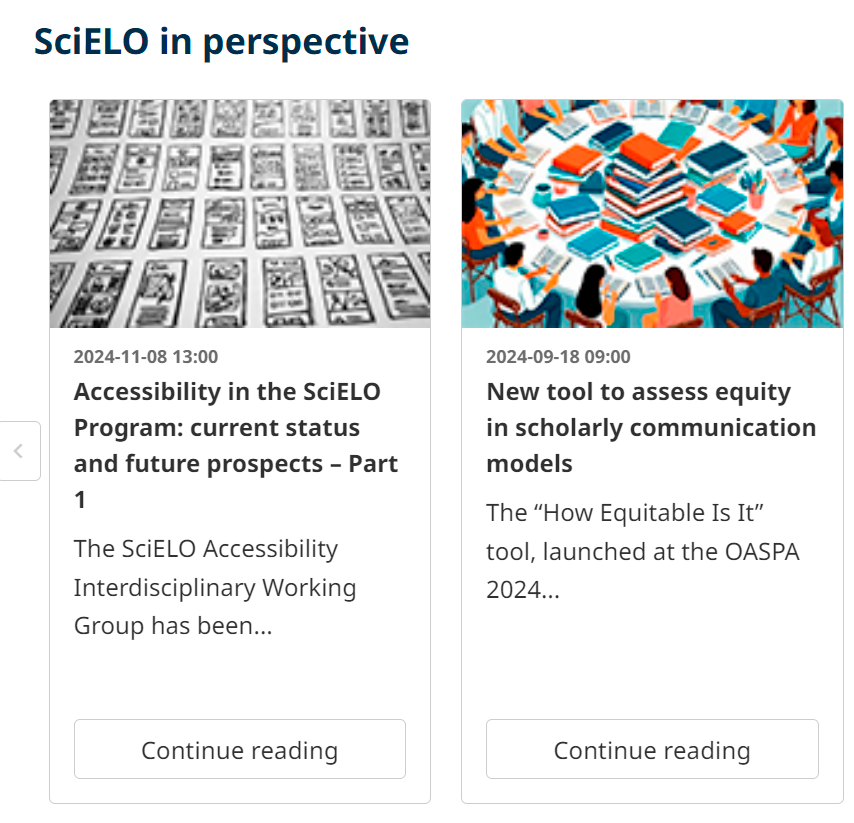
Image description: Screenshot of the “SciELO in Perspective” section on the home page of the SciELO Brazil Collection website in the version after adjustments, where there are two boxes displaying the latest posts published on the SciELO in Perspective blog. From top to bottom, each box consists of an image, date of publication, title of the post, a short summary and a “continue reading” button. The background of the box is white and the links are black, with greater contrast. There is greater spacing between the lines. |
| After | 
Image description: Screenshot of the “SciELO in Perspective” section on the home page of the SciELO Brazil Collection website in the version after adjustments, where there are two boxes displaying the latest posts published on the SciELO in Perspective blog. From top to bottom, each box consists of an image, date of publication, title of the post, a short summary and a “continue reading” button. The background of the box is white and the links are black, with greater contrast. There is greater spacing between the lines. |
| Before | 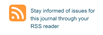
Image description: Screenshot of the RSS button located at the bottom of the page of journals indexed in the SciELO Brazil Collection in the version before the adjustments. The RSS icon is orange on the left, followed by the text “Follow the issues of this journal in your RSS reader” on the right, in two lines. The size of the text is small, as is the spacing between the lines. |
| After | 
Image description: Screenshot of the RSS button located in the footer of the journals indexed in the SciELO Brazil Collection after the adjustments. On the left-hand side there is a more simplified RSS icon in blue, followed by the text “Follow the issues of this journal in your RSS reader” on the right-hand side, in two lines. The size of the text is larger, as is the spacing between the lines. |
Adjustments have also been made to the font size and click area:
| Before | 
Image description: Screenshot of the alphabetical list of journals indexed in the Brazil Collection in the version before the adjustments. It shows a list of three journals. Each line is composed as follows: on the left-hand side there is a sequence of six icons in image format, with little contrast and spacing between them. On the right, the title of the journal, the number of issues and the publication date of the last issue. The information is arranged with little spacing between them, reducing the click area. |
| After | 
Image description: Screenshot of the alphabetical list of journals indexed in the SciELO Brazil Collection in the version after the adjustments. It shows a list with two journals. Each line is composed as follows: at the top, the title of the journal, the number of issues and the publication date of the last issue. Below the journal title, there is a sequence of six icons in image format, with greater contrast and spacing between them, as well as a square outline delimiting the icon area. The information is arranged with greater spacing between them, thus increasing the click area. |
The navigation path (known as the breadcrumb trail) is now available on all screens with the aim of situating and guiding users in their navigation. At the top of the SciELO website, users can understand the path taken through its pages, from the starting point to the content they are visiting at that moment.
By tracing this path, the site offers more navigation and search possibilities for users, who can return to pages they have visited or access the category and subcategory pages in order to search for new content.
| Before | 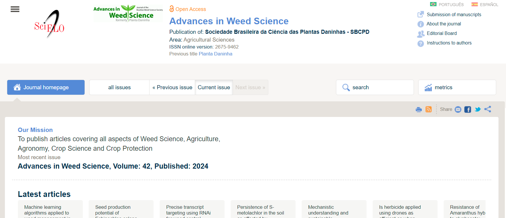
Image description: Screenshot of the home page of the journal Advances in Weed Science on the SciELO Brazil Collection website in the version before the adjustments. There is no navigation path (known as a breadcrumb trail) available. |
| After | 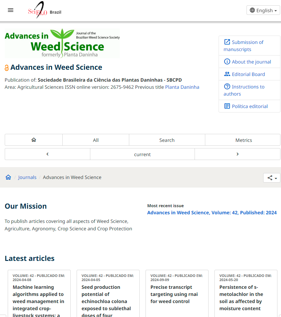
Image description: Screenshot of the home page of the journal Advances in Weed Science on the SciELO Brazil Collection website in the version after the adjustments. You can see a navigation path (known as a breadcrumb trail) available just below the header, and before the main content of the page. The header shows the following sequence: House icon (home page) / Journals / Advances in Weed Science. |
The breadcrumb trail seen in isolation:

Image description: Screenshot of the isolated navigation path on the SciELO Brazil Collection website in the version after the adjustments. It shows the following sequence: House icon (home page) / Journals / Advances in Weed Science. The navigation path is set against a gray background. |
The breadcrumb trail has been added to all screens. It helps to understand the navigation by displaying the path taken from the home page to the current page and allows users to navigate to each of the previous steps.
On mobile, it only shows the previous step.

Image description: Screenshot of the isolated navigation path on the SciELO Brazil Collection website in the version after the adjustments. It shows the following sequence: left arrow / Journals, indicating that it is possible to go back one step. On the far right-hand side, there is a button for sharing on social networks. The navigation path is set against a gray background. |
Headings have been standardized to help users understand the hierarchy and context of the content of the SciELO website pages, to classify search results and to adopt keyboard shortcut search mechanisms, which are widely used by screen reader users.
| Before | |
| Journals list – H1 | 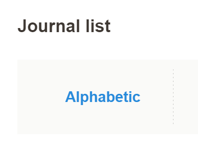
Image description: Screenshot of the “Journal list” section on the home page of the SciELO Brazil Collection website in the version before the adjustments. |
| Journals – H1 | 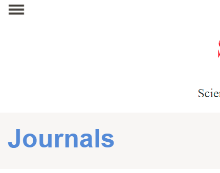
Image description: Detail screenshot of the title “Periodicals” on the home page of a journal indexed on the SciELO Brazil Collection website in the version before the adjustments. |
| Our Mission – H1 | 
Image description: Detailed screenshot of the “Our Mission” section of the homepage of a journal indexed on the SciELO Brazil Collection website in the version before the adjustments. |
| After | |
| Journals list – H2 | 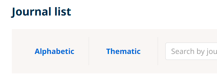
Image description: Screenshot of the “List of journals” section on the home page of the SciELO Brazil Collection website in the version after the adjustments. There is no visible change compared to the previous version, but the change in the hierarchical level (use of header tags) improves reading by assistive tools. |
|
Journals – Breadcrumb trail Our Mission – H2 |
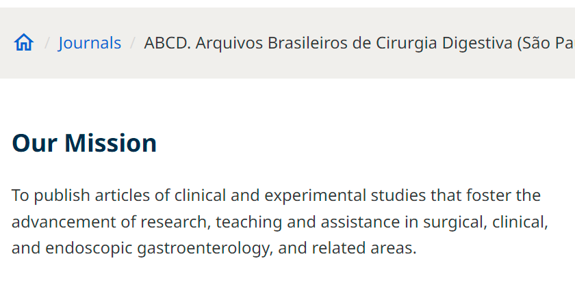
Image description: Screenshot detailing the navigation path (previously displayed as the title) and “Our Mission” section on the home page of a journal indexed on the SciELO Brazil Collection website in the version after the adjustments. The correct use of heading tags improves reading by assistive tools. |
Accessibility in the SciELO Program: current status and future prospects
Notes
1. The SciELO Interdisciplinary Accessibility Working Group consists of: Alex Mendonça (SciELO), Amanda Ramalho (SciELO Livros), Giovanna Brito Castelhano (SciELO Livros), Solange Santos (SciELO), Leonardo Santos Amâncio Cabral (Gp-Idea/UFSCar), Aline Maira da Silva (RBEE), Ilda Fontes (RAE), Roberta Cardoso Cerqueira (HCSM), Carlos Henrique de Castro Gonçalves (Editora De Castro), and Ramon Cordini (rcordini). ↩
2. WAVE Web Accessibility Evaluation Tools ↩
3. SciELO ACCESSIBILITY. Accessibility in the SciELO Program: current status and future prospects – Part 1 [online]. SciELO in Perspective, 2024 [viewed 14 November 2024]. Available from: https://blog.scielo.org/en/2024/11/08/accessibility-in-the-scielo-program-pt-1/ ↩
4. IVEY, S. The Importance of Usability and Accessibility in Design [online]. Career Foundry. 2022 [viewed 14 November 2024]. Available from: https://careerfoundry.com/en/blog/ux-design/the-importance-of-usability-and-accessibility-in-design/#accessibility-vs-usability ↩
5. AccessMonitor ↩
6. European accessibility act ↩
References
ARDITI, A. and CHO, J. Serifs and font legibility. Vision Research [online]. 2005, vol. 45, no. 23, pp. 2926-2933 [viewed 14 November 2024]. https://doi.org/10.1016/j.visres.2005.06.013. Available from: https://www.sciencedirect.com/science/article/pii/S0042698905003007
CHATRANGSAN, M. and PETRIE, H. The effect of typeface and font size on reading text on a tablet computer for older and younger people. In: W4A ’19: Web For All 2019 Personalization – Personalizing the Web, San Francisco, 2019 [viewed 14 November 2024]. https://doi.org/10.1145/3315002.3317568. Available from: https://dl.acm.org/doi/proceedings/10.1145/3315002
DOGUSOY, B., CICEK, F. and CAGILTAY, K. How Serif and Sans Serif Typefaces Influence Reading on Screen: An Eye Tracking Study. In: Conference: International Conference of Design, User Experience, and Usability, Toronto, 2016 [viewed 14 November 2024]. https://doi.org/10.1007/978-3-319-40355-7. Available from: https://link.springer.com/book/10.1007/978-3-319-40355-7
IVEY, S. The Importance of Usability and Accessibility in Design [online]. Career Foundry. 2022 [viewed 14 November 2024]. Available from: https://careerfoundry.com/en/blog/ux-design/the-importance-of-usability-and-accessibility-in-design/#accessibility-vs-usability
SciELO ACCESSIBILITY. Accessibility in the SciELO Program: current status and future prospects – Part 1 [online]. SciELO in Perspective, 2024 [viewed 14 November 2024]. Available from: https://blog.scielo.org/en/2024/11/08/accessibility-in-the-scielo-program-pt-1/
External links
SciELO Interdisciplinary Accessibility Working Group
WAVE Web Accessibility Evaluation Tools
Translated from the original in Portuguese by Lilian Nassi-Calò.
Como citar este post [ISO 690/2010]:








Recent Comments